Signage and Wayfinding – Designing Paths That Communicate
Design doesn’t always live on screens or pages — sometimes, it exists in the spaces people move through. Signage and wayfinding design is one of those areas where visual communication meets human behavior. It’s about guiding, informing and creating an experience that helps people navigate seamlessly while connecting them to the spirit of a place. My project at Rajwada was a deep exploration of that intersection — where design wasn’t just seen, but experienced through movement, orientation and interaction.
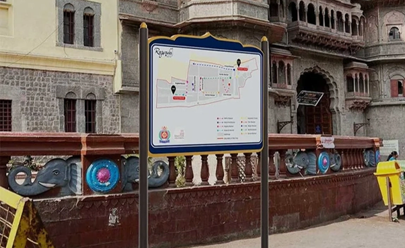
The challenge was to design a comprehensive wayfinding and signage system that not only directed visitors efficiently but also reflected the essence of Rajwada — a place steeped in cultural heritage, architectural beauty and history. I wanted the design to feel like an extension of the environment, not a distraction from it. Every element had to resonate with the identity of the space while maintaining absolute clarity of communication.
The process began with studying the flow of people — how they entered, where they paused, how they transitioned from one zone to another. Understanding these behavioral patterns was essential to designing a system that would intuitively guide them. I mapped out the journey of a visitor, identifying the points where they might seek direction, information or reassurance. This mapping process formed the foundation for the placement and hierarchy of the signage system.
Once the structure was clear, I moved to the design stage, creating a series of visual elements that could communicate effortlessly even from a distance. The iconography was developed to represent functions, facilities and directions in a simple yet culturally resonant way. Each icon was designed to be easily recognizable, maintaining consistency in stroke, proportion and visual rhythm. I wanted them to reflect both modern clarity and traditional warmth — fitting seamlessly into the heritage aesthetic of Rajwada.
The system included different types of signages — each serving a specific purpose within the space. Directional signs guided people across pathways and corridors, helping them orient themselves without confusion. Informational signages shared contextual details about the site, enriching the visitor’s understanding and connection to the space. Identification signs were used to mark key areas and facilities, providing clarity while maintaining the visual harmony of the overall design.
Color and typography played a vital role in establishing hierarchy and readability. The palette drew inspiration from Rajwada’s architectural tones, creating a visual connection with the built environment. The typography was chosen to be elegant yet highly legible, ensuring that the signage looked cohesive during both day and night. The materials and finishes were conceptualized to withstand the environment while retaining aesthetic balance, making the system both durable and visually timeless.
Working on this project deepened my understanding of how spatial design relies heavily on empathy. Wayfinding is not just about arrows and names — it’s about anticipating human movement, understanding hesitation points and designing cues that gently guide. Every decision — from the size of an icon to the placement of a directional board — affects how people feel while navigating a space. My goal was to make the environment intuitive enough that visitors could move confidently without realizing how subtly design was helping them.
One of the most fulfilling moments of this project was seeing how the visual language created a sense of coherence across the entire site. The signage didn’t overpower the architecture; it complemented it. The icons, type and forms came together to form a system that felt natural — one that blended functionality with a sense of place. It was an exercise in restraint, balance and cultural sensitivity.
The Rajwada wayfinding project taught me that good design doesn’t always need to demand attention — sometimes, its greatest strength lies in invisibility. When signage works perfectly, people barely notice it. They simply find their way with ease and that quiet efficiency is the true success of the design. It’s a discipline that tests precision, empathy and the ability to merge visual design with spatial logic.
For me, this project reaffirmed why I love communication design — it has the power to make environments more humane, accessible and meaningful. Through Rajwada, I learned how wayfinding design is not just about direction — it’s about designing experiences that guide people with grace, clarity, and care.
Must explain to you how all this mistaken idea of denouncing pleasure and praising pain was born and I will give you a complete account of the system, and expound the actual teachings of the great explorer of the truth, the master-builder of human happiness. No one rejects, dislikes, or avoids pleasure itself, because it is pleasure, but because those who do not know how to pursue pleasure rationally encounter consequences that are extremely painful. Nor again is there anyone who loves or pursues or desires to obtain pain of itself, because it is pain, but because occasionally circumstances.
No one rejects, dislikes, or avoids pleasure itself, because it is pleasure, but because those who do not know how to pursue pleasure rationally encounter consequences that are extremely painful. Nor again is there anyone who loves or pursues or desires to obtain pain of itself because it is painse
April 5, 2025