Infographics – Turning Data into Visual Stories
In a world overflowing with information, clarity is power. Infographics are where design meets data — transforming dry facts into stories that are not only understood but remembered. For me, infographics represent one of the most exciting intersections of creativity and communication. They allow a designer to merge analytical thinking with visual storytelling, crafting experiences that simplify complexity while maintaining beauty and balance.
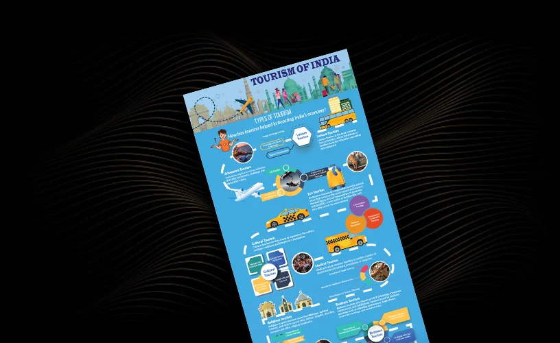
One of my favorite projects in this space was an infographic based on the different Types of Tourism. The goal was to organize a vast topic, layered with multiple forms and subcategories, into a clear and visually engaging layout that could educate and capture attention at the same time. The research phase began with studying various kinds of tourism, each holding its own character and essence. I explored how leisure tourism revolves around relaxation and recreation, adventure tourism brings thrill and excitement and ecotourism promotes sustainability and responsible travel. Cultural tourism focuses on heritage and traditions, while medical tourism revolves around travel for treatments and procedures. Religious tourism brings spiritual journeys to sacred destinations, business tourism deals with corporate events and conferences, gastronomic tourism celebrates food and culinary heritage, nautical tourism connects travelers with water-based activities and sports tourism encourages participation or spectating in athletic events.
Each form of tourism offered a unique insight into why people travel and what experiences they seek. My aim was to capture all of that information in a single frame, allowing the viewer to understand it at a glance. To support this, I incorporated visual data elements like bar graphs and pie charts that represented statistics such as the popularity and global reach of different tourism categories. These visual comparisons added rhythm to the design and made it easy for the audience to comprehend variations without the need for heavy text.
Icons played a crucial role in establishing identity for each tourism type. Every category was represented by a carefully designed symbol that reflected its essence. These icons became visual anchors that guided the viewer’s eye seamlessly across the infographic. The visual consistency allowed the information to flow naturally, ensuring that the content remained engaging even for complex subjects.
Designing this infographic was a delicate balance between aesthetics and functionality. It required me to constantly evaluate how much information should be visible at once and how to guide the viewer’s attention through structure and form. Too much text could overwhelm; too little could weaken the message. I spent considerable time refining the layout, creating balance between visual hierarchy and negative space, ensuring that every element existed with purpose and precision.
What made this project special was the transformation of research into an experience. The infographic not only conveyed facts but also told a visual story about the diversity of tourism and how travel connects people, cultures and economies. It became an educational piece that simplified understanding while celebrating the vibrancy of the travel industry.
This project reaffirmed one of my strongest beliefs as a designer — that good design does not merely decorate; it clarifies. When visuals and data work together harmoniously, they turn complex information into an engaging story that captures both the eye and the mind. Through this infographic, I realized how data visualization is not just about representation but about communication. It is about shaping understanding, guiding perception and transforming knowledge into something meaningful
Creating the “Types of Tourism” infographic reminded me that design can turn data into dialogue. Every line, color and icon contributed to building a visual language that spoke directly to the viewer. The process was a reminder that design is not about adding elements — it’s about connecting ideas. And when that connection is achieved, even something as factual as tourism categories becomes an engaging visual journey that leaves a lasting impression.
Must explain to you how all this mistaken idea of denouncing pleasure and praising pain was born and I will give you a complete account of the system, and expound the actual teachings of the great explorer of the truth, the master-builder of human happiness. No one rejects, dislikes, or avoids pleasure itself, because it is pleasure, but because those who do not know how to pursue pleasure rationally encounter consequences that are extremely painful. Nor again is there anyone who loves or pursues or desires to obtain pain of itself, because it is pain, but because occasionally circumstances.
No one rejects, dislikes, or avoids pleasure itself, because it is pleasure, but because those who do not know how to pursue pleasure rationally encounter consequences that are extremely painful. Nor again is there anyone who loves or pursues or desires to obtain pain of itself because it is painse
July 16, 2025